When most people around the world think about money, they’re probably thinking of the U.S. Dollar. That’s because the greenback is the world’s primary reserve currency.
At writing, global central banks currently hold about 58% of their foreign reserves in U.S. dollars. The rest is in euros (19.6%), British pounds (4.8%), Japanese yen (6%), and Chinese yuan (2.9%).
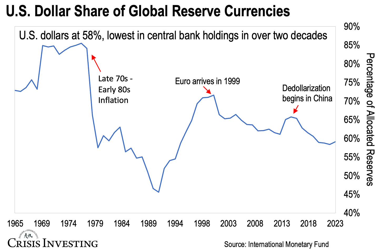
But, as impressive as this 58% figure sounds, it’s actually the lowest in more than two decades for how much central banks are keeping in dollars. You can see this in the graph below.
Now, let me walk you through some of the historical context to what you're seeing here.
Since the 1970s, the U.S. dollar’s share of global reserve currencies has had a bumpy ride. From 1978 to 1991, its share nosedived from 85% to 46%. This drop came after a surge of inflation in the U.S. during the late 1970s, which shook global confidence in the Fed’s ability to manage inflation. Even as inflation eased up in the 1980s, the dollar’s share kept falling.
By the 1990s, confidence in the dollar started to come back, and its share rebounded. But then the euro came along and put a stop to the dollar's gains. Since then, with the exception of a brief period between 2014 and 2016, the dollar’s share has continued to decline, fueled by China’s gradual shift away from trade in U.S. dollars in favor of the Chinese yuan.
Fast forward to today, and China (along with Russia and other BRICS countries) remains the main driver behind de-dollarization. From dumping U.S. dollar-denominated debt and starting oil trades in yuan to promoting its digital yuan (e-CNY) globally, China has been chipping away at the dollar’s global dominance.
It'll be interesting to see how today’s chart looks in a couple of years, especially since even in 1991, when the U.S. dollar hit its lowest global reserve share, it didn't face as much opposition as it does now from BRICS.
Regards,
Lau Vegys


Good chart, as always. Is there any reliable data on the percentage of international transactions denominated dollars, over time. Such a chart, if it exists, would be an interesting companion to the one in your post. Thanks as always for these weekly updates.
Agreed. It would just confirm that governments and the private sector are on the same path. The latter (private sector) is more significant, in my humble opinion.